Our objective was to refresh the Neepsend Brew Co brand while retaining their previous designs’ simplicity. As a cask-producing brewery with its own pubs, the brewery understood its drinkers didn’t want any fuss and to be able to quickly identify a beer by the colour of the pump clip.
The brewery wanted a cleaner, crisper look than their old designs whilst retaining some element of character that would differentiate them from other breweries in the city.
As the brewery was being rebranded, they also requested a new website with an e-commerce platform to be built by Hop Forward as part of the project.
As we are well-versed with the Neepsend Brew Co’s brewery, pubs, and the local culture, we made a conscious decision to incorporate visual elements in our design that subtly but effectively represent the essence of Neepsend and Sheffield.
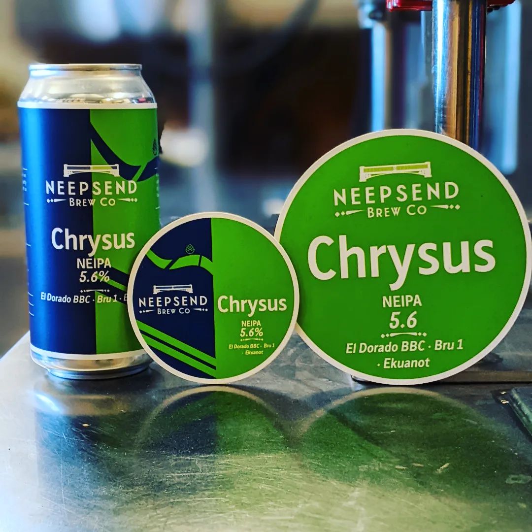
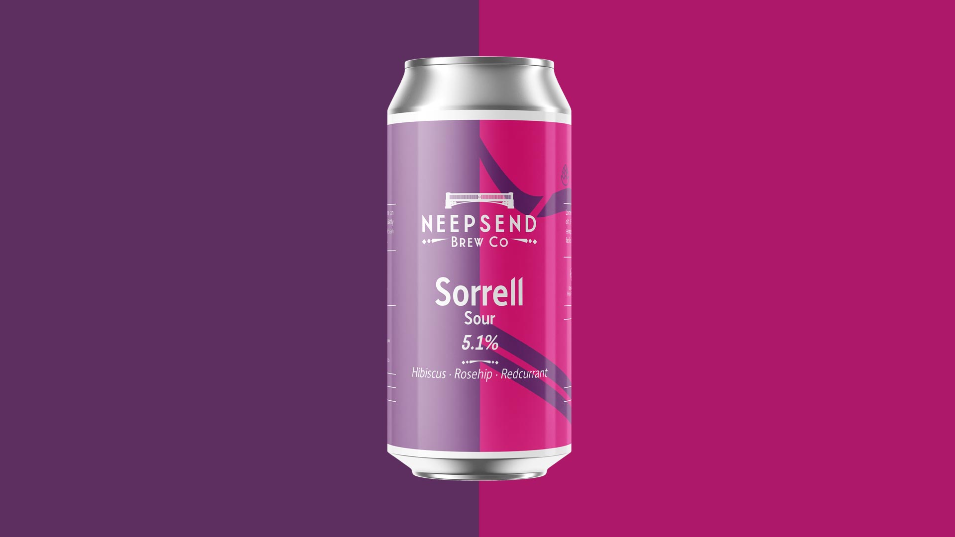
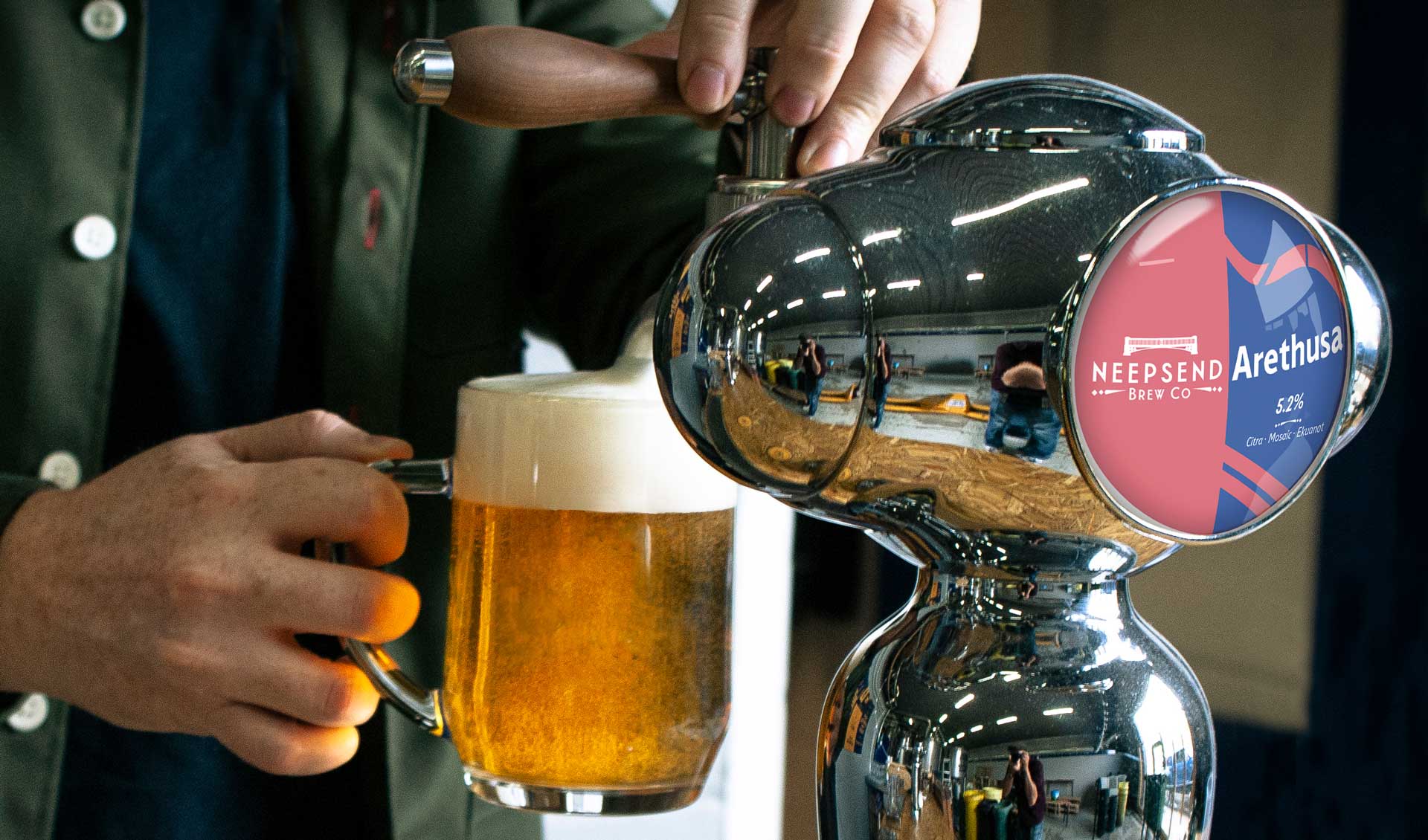
Our approach involved drawing a map that could also be interpreted as abstract shapes, besides the pre-existing logo. The map features two parallel lines that signify the A61 ring road, the broken curved line that represents the River Don, and the two lines that break the curve that represent Ball Street and Rutland Road bridges. We also incorporated the location of the brewery by featuring a hop in the design.
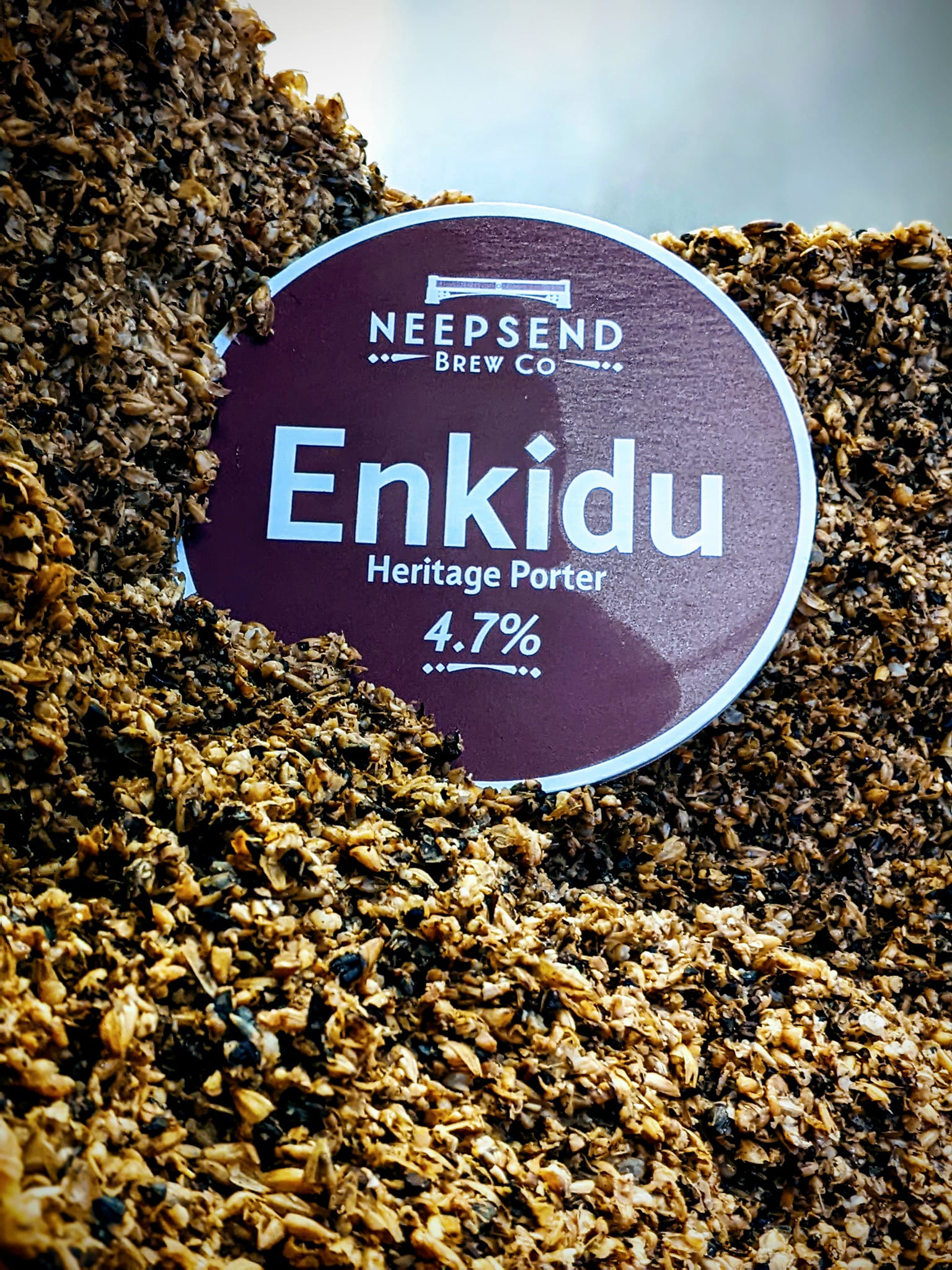
As we delved into the simplistic design of the pump clips, we realized that the typography would be the key factor in making them stand out. To achieve a unique and distinctive look, we drew inspiration from Five Point Brewing Company’s clever use of lettering and print ephemera from the late 19th-century London train stations. Following this, we decided to incorporate Sheffield’s official font designed by Jeremy Tankard StudioTye, which we licensed for the purpose.
Interestingly, the studio’s website states that this font is ‘quietly informing and directing the way around Sheffield’, which resonated with us and made it the perfect choice for the Neepsend Brew Co brand. The brand is known for ‘quietly brewing the kind of beer we enjoy’, and we were confident that the use of this font would effectively communicate the brand’s values and personality.


New visual identity system, color palette and typography selection

Website design and development.
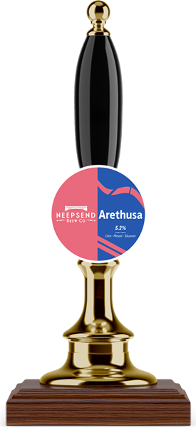

Packaging design for cans, mini-kegs, pump and keg clips.

Design and set-up of WooCommerce.