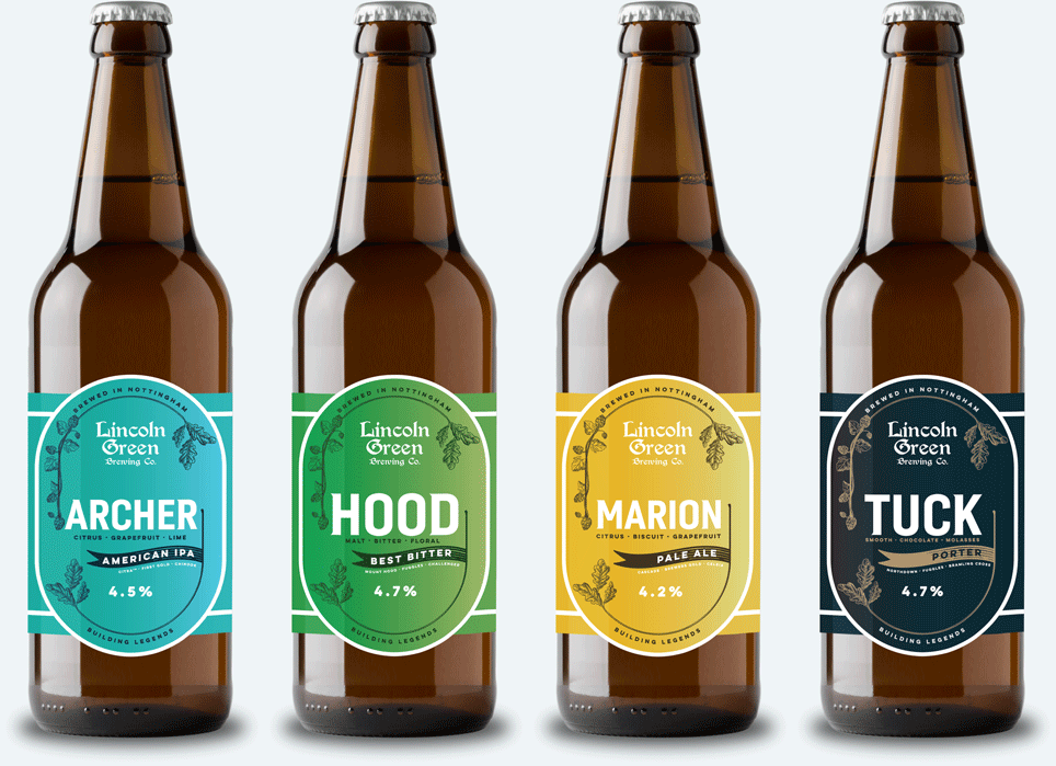
The consistency of design, combined with the quality of the beers helped set Lincoln Green apart from a highly competitive marketplace – indeed, within the same year, fourteen other microbrewery businesses started trading.
In design terms, it was recognised that the original artwork – 8 years old by this point – had become somewhat dated and ‘clunky’. Throughout 2019, we sought advice from local and national designers with a brief to refresh the designs with a more contemporary approach, whilst retaining a sense of heritage and tradition befitting to a brand that takes its name from the colour of dyed woollen cloth associated with the legend of Robin Hood.
Anthony Hughes of the brewery states, ‘This brief proved challenging for most – we were presented with plenty of ideas from designers who managed either to produce a contemporary design or designs filled with traditional cues. Enter Nick Law, the Creative Director behind Hop Forward, a creative agency specialising in marketing, branding and business development for breweries and the beer industry – and host behind one of brewing’s ‘must listen to’ podcasts’.
‘We were drawn to the flat-sided oval, which itself seemed unusual and remains a core visual signature to our final concept, and we loved the hop leaf flourish which feels simple and elegant. Wanting to communicate useful information to our customers at the point of purchase, we introduced three-word descriptors for flavours, which echo the Cyclops approach and were selected from the most frequently used customer descriptors on popular online review sites. Add in the names of the hops used in the beers and you’ve got all the information you need to make your choice’.
We first redeveloped the Core Range, drawing design inspiration from modern packaging design, whilst retaining the distinguishing features of the brewery and its heritage. This included giving subtle nods to the legendary Robin Hood story without ever blatantly stating it.
When the brewery looked to enter the craft beer market, brewing a wider range of beer styles that suited keg and can that targeted a different segment of consumers, they needed a concept to suit. We worked with the brewery to help develop the look and feel of the Blackshale Project, which in turn helped to re-inform the branding as a whole from 2022 onwards.

Not only have we designed pump and keg clips for the brewery, but we’ve created packaging designs for gift packs and a wide variety of labels with various print finishes.
We’ve designed various point-of-sales materials to help market the brewery and raise brand awareness, including bespoke signage, pitch decks for fundraising, advertising for publications and programmes, merchandise and more.

Hop Forward nailed the brief very quickly, grasping that we were looking for something cleaner, and more contemporary, whilst retaining a feel of heritage and tradition. We’re really pleased with the end results and would heartily recommend Hop Forward to others!